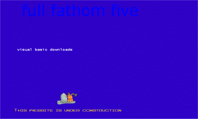
Well
it's not bad for a first attempt.... Mmmm, who am I kidding. I wasn't actually
sure what I wanted my web-site to look like. Not even sure what I wanted to
put on it. If you're going to start your own web-site then the best thing to
do it plan. Plan what you want to put on the web and then design what you want
it look like. The most important thing, I think, in design are colours... and
that's what I tried to do with the next attempt.
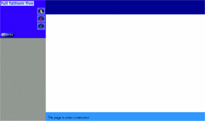
At
least the next attempt is better..... looking alot more brighter. Still at this
stage I didn't really know what I wanted to achieve, this was the main downfall.
Like I said planning is important - colours, fonts, graphics. They all need
to be worked out. There's no good having pages that look different - you need
continuity.. This what I tried to achieve with this design. But I was still
thinking big. What I thought I needed was soem 'flash' graphics... The stuff
that takes ages to download. By the time the page is half-way through loading
you've gone off somewhere else... Hopefully with the new design it's quick,
easy and looks good.